Savvy business owners know that earning high-quality leads through contact forms can be an uphill battle. A recent FormAssembly study revealed that, on average, only 27 percent of leads who fill out web forms are qualified.
As discouraging as this might sound, designing a highly optimized contact form to help you qualify leads isn’t as difficult as you might think. And it’s well-worth making the effort, because optimizing your web forms helps you to identify and nurture the leads who are most likely to becoming paying customers.
So, how can you design more effective contact forms for your business? Here are eight essential practices for developing lead generation forms that will score your company more prospects.
1) Remember that less is more
When it comes to form fields, less is definitely more. In fact, a Hubspot study found that companies that reduced their number of form fields from four to three had a 50 percent higher conversion rate.
Speaking generally, it’s best to keep your form as short as possible and only request the most essential information — too much information can overwhelm prospects, and cause them to abandon your form. In some cases, you might want to only ask for their name and email address so you can send them more information about your offerings.
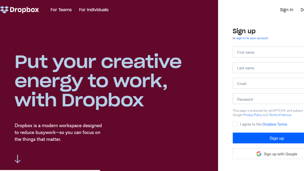
Here’s an example from Dropbox of a form with just four simple fields:

2) Ask the easy questions first
With contact forms, always ask the easy questions first. This includes things like a prospect’s name and email address, which are a no-brainer for them to enter, since many of your leads will already have this information stored on their web browsers.
If you can encourage them to enter this basic information, they will be much more motivated to actually finish the form. On the other hand, if filling out the form takes too much effort, many leads will quickly abandon it.
3) Pay attention to your layout
The design of your form is also extremely important for increasing conversions. Make sure your contact forms are easy to fill out, attractive, and professional, to give your audience the best possible experience. A positive user experience gives leads a good impression of your brand, and is much more likely to convert website visitors into customers.
Always design forms with one column and only one question per row. Forms with a single column layout are faster to fill out, which translates to a better user experience. Also, make sure that all text is aligned on the left side of the form for easy reading, and that field labels are directly above the input fields.
4) Hold off on asking for phone numbers
You definitely want to avoid asking for visitors’ phone numbers on your contact forms. This is because most website visitors don’t want to hand over highly sensitive personal information like phone numbers right away. (And yes, many of them will abandon your form if you insist on asking for their phone number.)
Asking for a phone number also adds an extra field to your contact form, which you’ll generally want to avoid. The best course of action is to always ask for your visitors’ email addresses instead of their phone numbers. And if you absolutely must have their phone numbers, always make this field optional.
5) Always aim above the fold
You’ve probably heard that you should place contact forms ‘above the fold’ — this means placing them at the top of the page so visitors don’t have to scroll down to see them. Research has demonstrated that website visitors are most engaged when viewing content located above the fold.
Placing your web form at the top of the page catches their eye right away, and draws their attention to your CTA. It’s also important to keep in mind that your lead generation forms need to stand out so your visitors don’t miss them.
In this excellent example from eHarmony, the lead-capture form is the first thing visitors see:

6) Don’t forget to optimize for mobile
Tons of users are browsing websites and filling out forms on their mobile devices these days, which means your contact forms need to be mobile-friendly (also known as mobile-responsive). It’s critical that your visitors can easily view all of your web content on their devices, including your contact forms.
When designing forms for mobile, make sure all of the fields fit on users’ screens for easy viewing — users often abandon forms if they have to scroll left or right to read them. Be sure to also design your form so that fields can be filled out quickly and easily on mobile devices. (Other key mobile optimization tips include using a single-column design, adding highlights to input fields as users edit them, and showing their password as they type it out.)
7) Handle error messages with care
When designing your contact forms, pay attention to how you handle error messages. Error messages can be genuinely frustrating for users, so you should aim to reduce their frustration as much as possible.
Keep in mind that error messages should use natural and humanizing language, should clearly point out errors, and should never blame the user. Make sure it’s clear what users need to do to fix the errors, and use inline validation instead of displaying every single error at the top of the page.
8) Link to an offer they can’t refuse
Another surefire way to bring in more leads with your forms is to link to an offer for exclusive content. Ask your visitors to provide their contact information in exchange for a valuable piece of content, such as an e-book, whitepaper, or report that addresses their specific concerns. This is a consistently high-performing method for boosting your lead generation efforts, so it’s definitely worth your while if you have the resources to do it.
Here’s an example from Leadformly of a lead form that links to a free trial:

Ultimately, having a highly optimized contact form is one of the most important steps you can take to increase the number of qualified leads you’re bringing in. By following these steps, you can design contact forms that are more user-friendly, which will make your visitors more inclined to finish filling them out.
The post How to optimize your contact forms to earn more leads appeared first on CallRail.